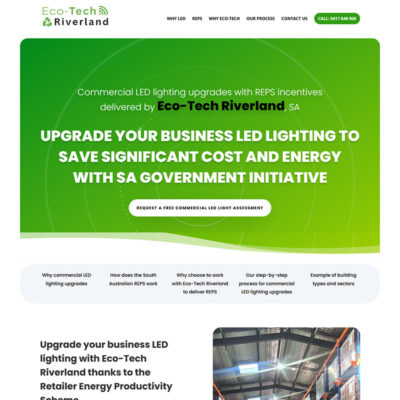
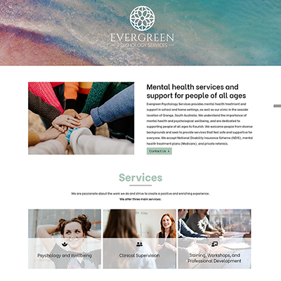
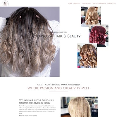
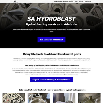
One page website
Increase conversions on a one-page website, guiding visitors towards your desired goals.
A well-designed one page website is your online storefront, offering a glimpse into your expertise, services, and unique offerings. Even if it’s a one page website, it is a powerful tool to promote your business and brand to customers and the wider community.
One page website
A guide to design a well performing one page website
A well-designed one page website is your online storefront, offering a glimpse into your expertise, services, and unique offerings. Even if it’s a one page website, it is a powerful tool to promote your business and brand to customers and the wider community.
A one page website can have its advantages, and many times when people are looking to have one page website built, they use the word interchangeably with a landing page and a simple web page. But there are some differences, which we will take you through on this page.
Website Adelaide has developed over 500 websites since the beginning of 2012, many of which have been one page websites. To help you choose the best one page website design solution for your business, we have included some comparisons and examples of one page website design and how to structure a one page website to be considered for displaying and ranking on Google.
One page website
The difference between one page website, single page website, and a landing page
So, let’s start by looking at the difference between the terms “single page website”, “one page website”, and “campaign landing page website” which are often used synonymous, but there are some subtle differences between them.
View this one page website for : Hot Water Systems in Glenelg
A single page website
A single page website is sometimes referred to as a brochure-like website because it is designed to provide visitors with a brief overview of a business, a brand or individual, similar to a brochure. Brochure-like websites are typically simple and easy to navigate, and they often use big bold images and text to tell a story about the business, the individual or specific brand.
Campaign landing page
A campaign landing page website is a type of one page website that is designed to promote a specific product or service. Campaign landing pages are often used in marketing campaigns, as they can help to increase conversions. Campaign landing page content are typically shorter, concise, and designed to be persuasive and to encourage visitors to take a specific action, such as making a purchase or signing up for a newsletter.
One page website
A one page website is similar to a single page website but may contain more content and functionality and may feature an e-commerce store. One page websites can be a bit more complex to create as they normally are a bit longer, longer scroll, than a single page website, but they can be more effective for businesses that need to provide visitors with a lot of information.
| Feature | Single page website, brochure like website |
| Number of pages | 1 |
| Content | Brief overview of a business or individual |
| Complexity | Easy to create and maintain |
| Effectiveness | Can be effective for small businesses or personal websites |
| Purpose | To provide visitors with a brief overview of a business or individual |
| Focus | On the business or individual as a whole |
| Design | Brochure like, simple and easy to navigate |
| Call to action | To encourage visitors to learn more about the business or individual |
| Feature | One page website design |
| Number of pages | 1 |
| Content | More content and functionality |
| Complexity | More complex to create and maintain |
| Effectiveness | Can be more effective for businesses that need to provide visitors with a lot of information |
| Purpose | To provide visitors with more information about a business or individual |
| Focus | On specific aspects of the business or individual |
| Design | More complex and visually appealing |
| Call to action | To encourage visitors to take a specific action, such as making a purchase or signing up for a newsletter |
| Feature | Campaign landing page website |
| Number of pages | 1 |
| Content | Promotes a specific product or service |
| Complexity | Typically, more complex to create and maintain |
| Effectiveness | Typically, more effective for marketing campaigns |
| Purpose | To promote a specific product or service |
| Focus | On the product or service being promoted |
| Design | Typically, more complex, and visually appealing |
| Call to action | To encourage visitors to take a specific action, such as making a purchase or signing up for a newsletter |
Design and structure for one page websites
While one page websites visually look very different and are fit for individual business needs, high performing one page websites typically follows a best practice structure, layout, and functionality.
The most important aspect when designing a one page website is ensuring it’s informative, engaging, and easy to use.
Following these tips, you can create a one page website to help you achieve your business goals.
Here is a summary of key elements of a structurally sound one page website design.

Header for single page website
- Logo: A large, visually appealing logo should be displayed prominently at the top of the page.
- Navigation menu: A one page website can have a menu and the links in the menu will jump further down on the page to the specific section.

Hero Section
- Value proposition: A clear and concise statement of what your business does and how it can benefit your customers should be displayed prominently in the hero section.
- Supporting headline: A catchy and attention-grabbing headline that supports your value proposition should be displayed below the value proposition.
- Reason to believe: A statement that provides evidence to support your value proposition should be displayed below the supporting headline. This can be a statistic, a testimonial, or a case study.
- Social proof: Testimonials, reviews, and ratings from satisfied customers can be displayed below the reason to believe. This helps build trust and credibility with visitors.
- Call to action: A clear and concise call to action should be displayed below the social proof. This could be a button that encourages visitors to sign up for your newsletter, download a whitepaper, or make a purchase.

Body
- Summary of services and key benefits: A summary of your services and critical benefits should be displayed in the body of the website. This should be written clearly and concisely so that it is easy for visitors to understand.
- Case studies: Case studies can be a great way to showcase your work and demonstrate the value of your services.
- Testimonials: Testimonials from satisfied customers can be a powerful way to build trust and credibility with visitors.
- Contact information: Your contact information should be displayed prominently in the body of the website. This should include your email address, phone number, and physical address.

Footer
- Copyright information: Your copyright information should be displayed prominently in the footer. This should include the year that your website was created and the name of your business.
- Social media links: Social media links can be a great way to connect with visitors and promote your website.
One page website
The key differences between a one page website and a campaign landing page website
So, let’s start by looking at the difference between the terms “single page website”, “one page website”, and “campaign landing page website” which are often used synonymous, but there are some subtle differences between them.
| Feature | One page campaign page | One page website |
| Purpose | Persuade visitors to take a specific action | Provide visitors with more information |
| Length | Shorter | Longer |
| Words | Fewer | More |
| Imagery | More | Less |
| Header | Usually includes a logo, tagline, and call to action | Typically includes a logo, navigation menu, and search bar |
| Navigation menu | Typically, not included | Typically included |
| Search bar | Usually not included | Usually included |
| Hero section | Usually includes a hero image, headline (value proposition designed to urgently take actions), supporting headline, social proof to build trust, credibility and show positive experience to take immediate call to action. | Typically includes a hero image, headline (value proposition usually designed to introduce features and benefits), and call to action. Social proof more introduction to key benefits. |
| Supporting headline | More specific and persuasive | More general |
| Social proof | Typically includes testimonials, reviews, or ratings from satisfied customers. The key is to build trust to take quick action and move to purchase. | May include a larger amount of social proof, expanded in a testimonial section or a case study section. |
| Call to action | Specific and persuasive | More general |
| Body copy | Typically, shorter, and more focused on persuading visitors to take a specific action | Typically, longer, and more comprehensive and informative content. |
| Services and benefits | Usually highlighted in the body copy, many times in bullet points. | Typically included in a separate sections, and explaining why. |
| Case studies | Typically included in the body copy | Many times, included in a separate section |
| Testimonials | Typically shorter, concise, and included in the body copy, or as high up in the structure as possible | Usually included in a separate section and expanded. |
| Contact information | Typically, prominently displayed for quick call to action | Typically included in a footer |
View this one page website for : All Family Law in Adelaide
What are the benefits of a one page website?
Have you considered a one page website, here are the key benefits
User friendly
One page websites are user-friendly. Instead of developing a multi-page website with little content where the user needs to click between pages to find information, a one page website is designed so you can scroll down the page to find all the information quickly and easily.
Cost-effective
One page websites can be designed with a menu and are a cost-effective way to get your business online, particularly if you have limited text content. If you are a new business, we can quickly get a one page website online to help build your domain authority and then build out and add new pages as your business grows.
Mobile friendly
A one page website can be an excellent solution for a smaller business, and they are great for mobile phones, iPad, and small touch screen devices. Scrolling is a natural and easy movement on the phone, and around 60% of websites are viewed on a mobile device.
Branding opportunities
Many small businesses use one page websites to establish an online presence. One page websites can be used to showcase your brand and create a strong first impression. This can be done by using high-quality images, videos, and text.
Scalable and flexible
Here at Website Adelaide, every website we design is built to be flexible and responsive. We build WordPress websites because they offer a fantastic platform. We can quickly and easily add additional pages and new content, allowing your website to grow and change along with your business requirements. Once you have a one page website, we can add more pages to help you with SEO or add additional functionality like a shop to enable you to sell 24/7 directly from your website.
One page website design examples explaining each important section of the page
Here are some design examples for some of the key sections of a one page website. By following the tips that I have provided, you can create a one page website that is informative, engaging, and easy to use.
The HEADER of your singe page website
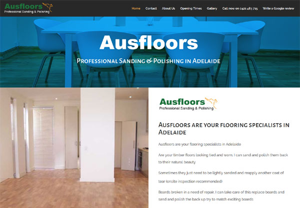
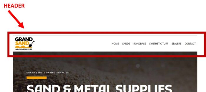
The header of a one-page website should be visually appealing and engaging. To maximize the visibility and impact of your logo, there are two primary areas where it is commonly placed: the header, typically positioned in the top left corner, and the favicon, a small icon adjacent to the address bar or browser tab title. It is important to ensure that your logo remains legible on various screen sizes, enabling it to leave a lasting impression as soon as visitors land on your page. The navigation menu should be clear and concise.
The HERO SECTION of your singe page website
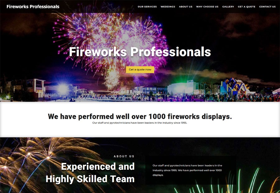
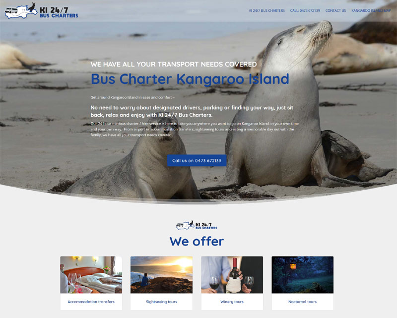
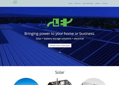
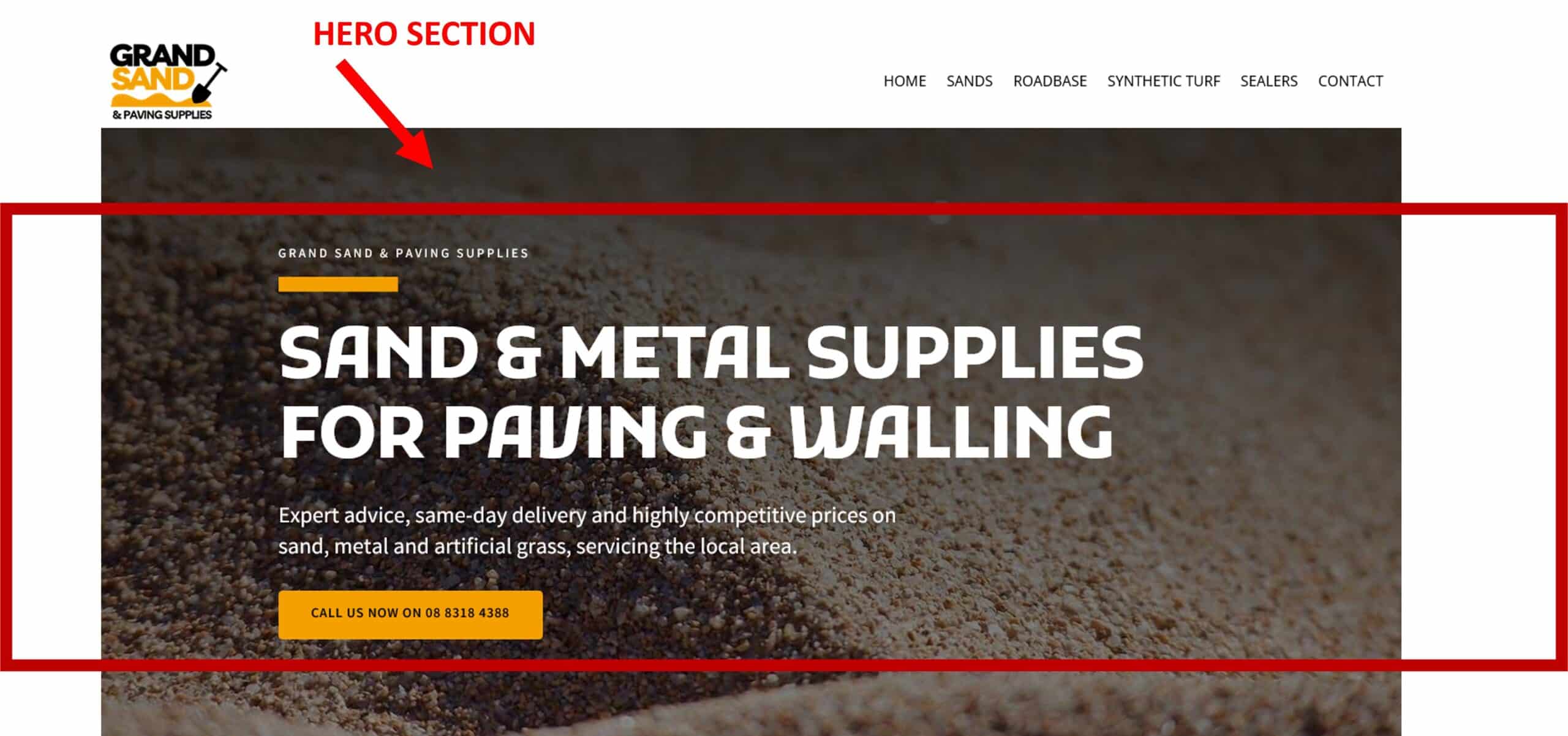
The hero section of a one page website should be attention-grabbing and informative. It should include the value proposition, supporting headline, reason to believe, social proof, and call to action. The value proposition should be clear and concise. The supporting headline should be catchy and attention-grabbing. The reason to believe should be credible and persuasive. The social proof should be from satisfied customers. The call to action should be clear and concise.
The BODY of your singe page website
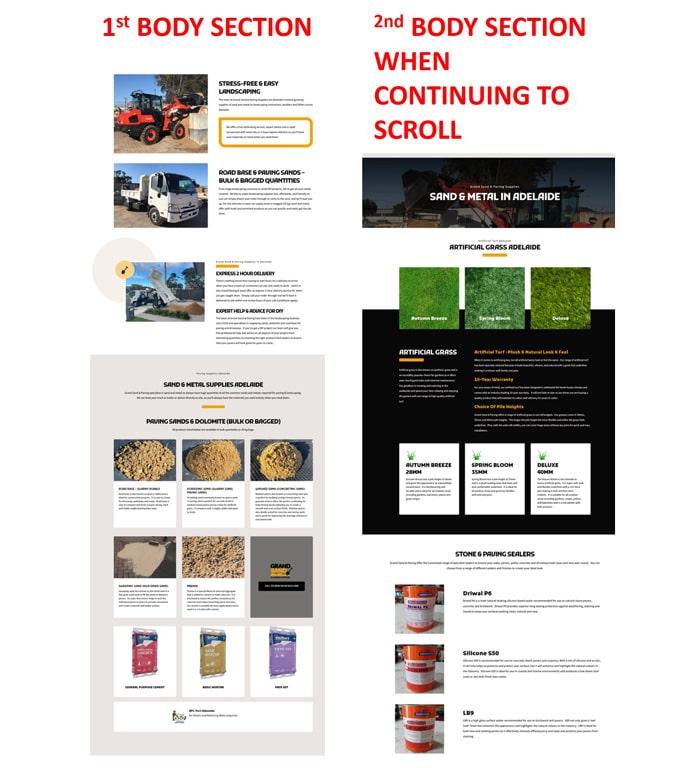
The body of a one page website should be informative and engaging. It should include a summary of services and key benefits, case studies, testimonials, and contact information. The summary of services and key benefits should be clear and concise. The case studies showcase your work and demonstrate the value of your services. The testimonials should be from satisfied customers. The contact information should be easy to find and use.
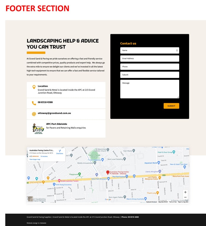
The FOOTER of your singe page website
The footer of a one-page website should include copyright information and social media links. The copyright information should include the year your website was created and the name of your business. The social media links should be easy to find and use.
One page website design for any sector, profession or trade
Effective and user friendly one page websites tailored to your business needs
Let’s explore how professionals from various sectors can benefit from a one-page website tailored to their unique needs:
-
One page website for health practitioners:
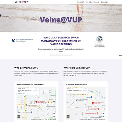
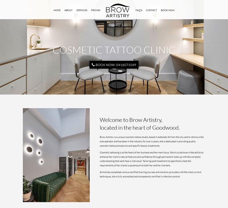
From chiropractors and nutritionists to therapists and fitness coaches, a one-page website offers a convenient platform to share your qualifications, specialties, and patient testimonials. Engage potential clients with compelling content, appointment scheduling features, and informative resources, all presented in a user-friendly layout.
-
One page websites for tradies:
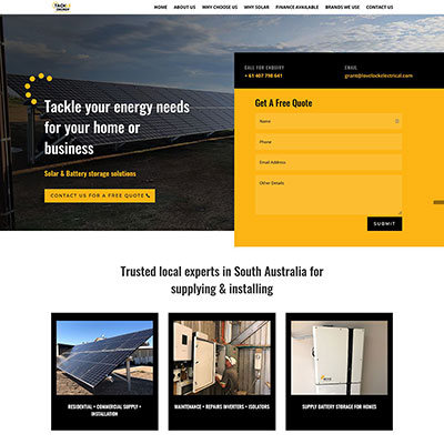
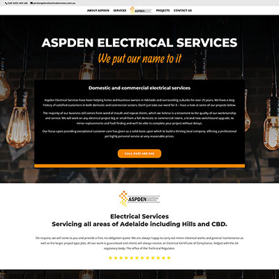
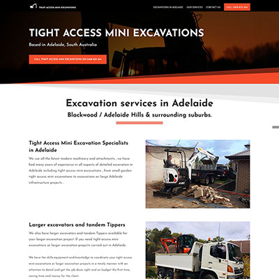
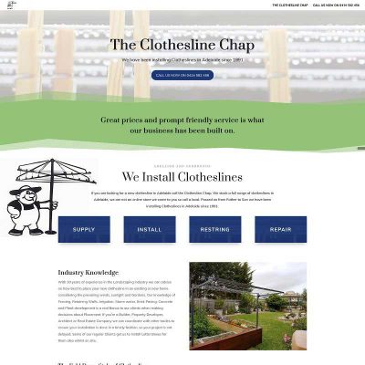
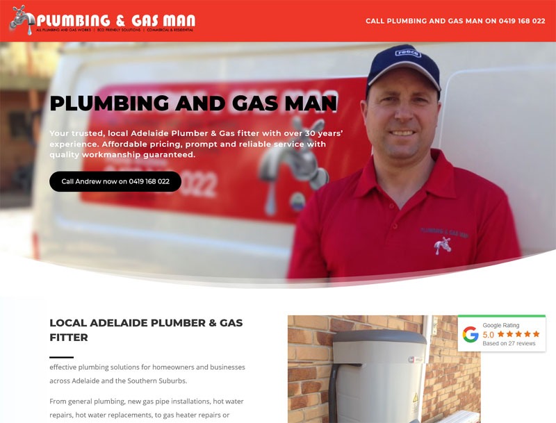
Plumbers, electricians, carpenters, and other tradespersons can effectively showcase their skills and services through a one-page website. Highlight your expertise, display past projects with striking visuals, and include contact details to encourage inquiries. A concise website emphasising professionalism can make a lasting impression on potential clients.
-
One page website for professional services:
Lawyers, consultants, accountants, and other professionals can establish credibility and attract clients with a well-crafted one-page website. Present your expertise, outline your services, and demonstrate your success stories through concise text, eye-catching visuals, and client testimonials. Streamline lead generation by incorporating a contact form or a direct call-to-action.
-
One page website for creative Industries:
Photographers, designers, artists, writers, and musicians can utilise a one-page website to showcase their portfolios, creative projects, and artistic vision. Engage potential clients, collaborators, or fans with stunning visuals, captivating storytelling, and seamless contact options.
The importance of an appealing value proposition
Remember, on a one page website with relative limited content, every element counts. One of the most important aspects of the web page is your value proposition as its pivotal in capturing attention, building trust, and driving conversions. Craft it carefully, ensuring it is clear, compelling, and tailored to resonate with your target audience.
Here is what an appealing value proposition will do for your one page website:
- Capturing attention:
In today’s digital age, attention spans are shorter than ever. Visitors to your website typically make snap judgments within seconds. A compelling value proposition helps grab their attention and make them want to stay and explore further. It communicates your product, service, or brand’s unique benefits and value, enticing visitors to engage and learn more. - Setting you apart:
A well-crafted value proposition helps differentiate your business from competitors. It highlights what sets you apart, emphasising the unique aspects of your offerings that address customer pain points or fulfil their needs better than alternatives. By clearly articulating your value, you position yourself as a standout choice and increase the likelihood of attracting and retaining customers. - Building trust and credibility:
A strong value proposition establishes trust and credibility with your audience. It shows that you understand their challenges and have a compelling solution. When you communicate the value your product or service delivers, backed by evidence such as testimonials, case studies, or social proof, you build confidence in potential customers, making them more likely to choose you over competitors. - Engaging the right audience:
A value proposition that resonates with your target audience helps attract the right visitors to your website. By clearly communicating who your product or service is for and how it addresses their specific needs, you can ensure that the people who land on your one-page website are more likely to be interested and potentially convert into customers. It saves both their time and yours by attracting those genuinely interested in what you offer. - Driving conversions:
An appealing value proposition can significantly impact your conversion rates. When visitors understand the value, they will receive by engaging with your business, they are more inclined to take the desired action, whether it’s making a purchase, signing up for a service, or providing their contact information. A well-crafted value proposition acts as a persuasive tool, nudging visitors towards conversion and maximising the effectiveness of your one-page website.
Examples of value propositions for a one page website
Here are some examples of short, concise and appealing value propositions.
“We help small businesses save time and money.”
This value proposition from a web design company focuses on the needs of small businesses. It explains how the company can help small businesses save time and money by designing and developing their websites.
This value proposition from a presentation software company focuses on the benefits of the software. It explains how the software can help users create beautiful presentations in minutes.
FAQ’s about one page website design
display none
Your content goes here. Edit or remove this text inline or in the module Content settings. You can also style every aspect of this content in the module Design settings and even apply custom CSS to this text in the module Advanced settings.
What is a one page website?
A one-page website is a website that contains all of its content on a single page. They are typically used by small businesses or individuals who need a simple and easy-to-navigate website.
What are the benefits of a one page website?
There are many benefits to using a one page website, including:
- Simple and easy to navigate: Visitors to a one page website can easily find the information they are looking for, as all the content is on a single page.
- Cost-effective: One page websites are typically less expensive to create and maintain than multi-page websites.
- Mobile-friendly: One page websites are typically mobile-friendly, designed to be viewed on smartphones and tablets.
- SEO-friendly: One page websites can be SEO-friendly, as they can be easily optimised for search engines.
- Branding opportunities: One page websites can showcase your brand and create a strong first impression.
- Call to action: One page websites can encourage visitors to take a specific action, such as making a purchase, signing up for a newsletter, or contacting you.
- Scalable: One page websites can be scaled up or down as your business grows.
- Flexible: One page websites can be customised to meet your specific needs.
Who is a one page website for?
One page websites are a good option for small businesses or individuals who need a simple and easy-to-navigate website. They are also a good option for businesses or individuals on a budget.
How much does a one page website cost?
The cost of a one page website will vary depending on the features you need and the company you hire to create it. However, one page websites are generally less expensive to develop than multi-page websites.
How long does it take to create a one-page website?
The time it takes to create a one page website will also vary depending on the features you need and the company you hire to make it. However, one page websites can be created more quickly than multi-page websites.
How can I make my one page website SEO-friendly?
There are a few things you can do to make your one page website SEO-friendly, including:
- Use relevant keywords throughout your website’s content.
- Create a sitemap for your website.
- Submit your website to search engines.
- Optimise your website’s images.
- Get backlinks to your website.
How can I make my one-page website mobile-friendly?
There are a few things you can do to make your one page website mobile-friendly, including:
- Use a responsive design.
- Optimise your website’s images for mobile devices.
- Test your website on mobile devices.
How can I add a call to action to my one page website?
A call to action is a button or link encouraging visitors to take a specific action, such as making a purchase, signing up for a newsletter, or contacting you. You can add a call to action to your one page website by including a button or link in your website’s footer or header.
How can I customise my one page website?
There are a few ways you can customise your one page website, including:
- Choose a template.
- Change the colours and fonts.
- Add images and videos.
- Add widgets and features.
How can I scale my one page website as my business grows?
As your business grows, you may need to scale your one page website. This can be done by adding new pages, features, and functionality. You may also need to upgrade your hosting plan.


